Dresser Size Guide: How to Choose the Right Dimensions

Learn how to choose the right dresser size for your bedroom, including standard dimensions, drawer depth, placement, and space-saving tips.

Learn how to choose the right dresser size for your bedroom, including standard dimensions, drawer depth, placement, and space-saving tips.

Explore 10 aesthetic bedroom color palettes that always work together — find the perfect calming, warm, or moody mood for your dream bedroom.
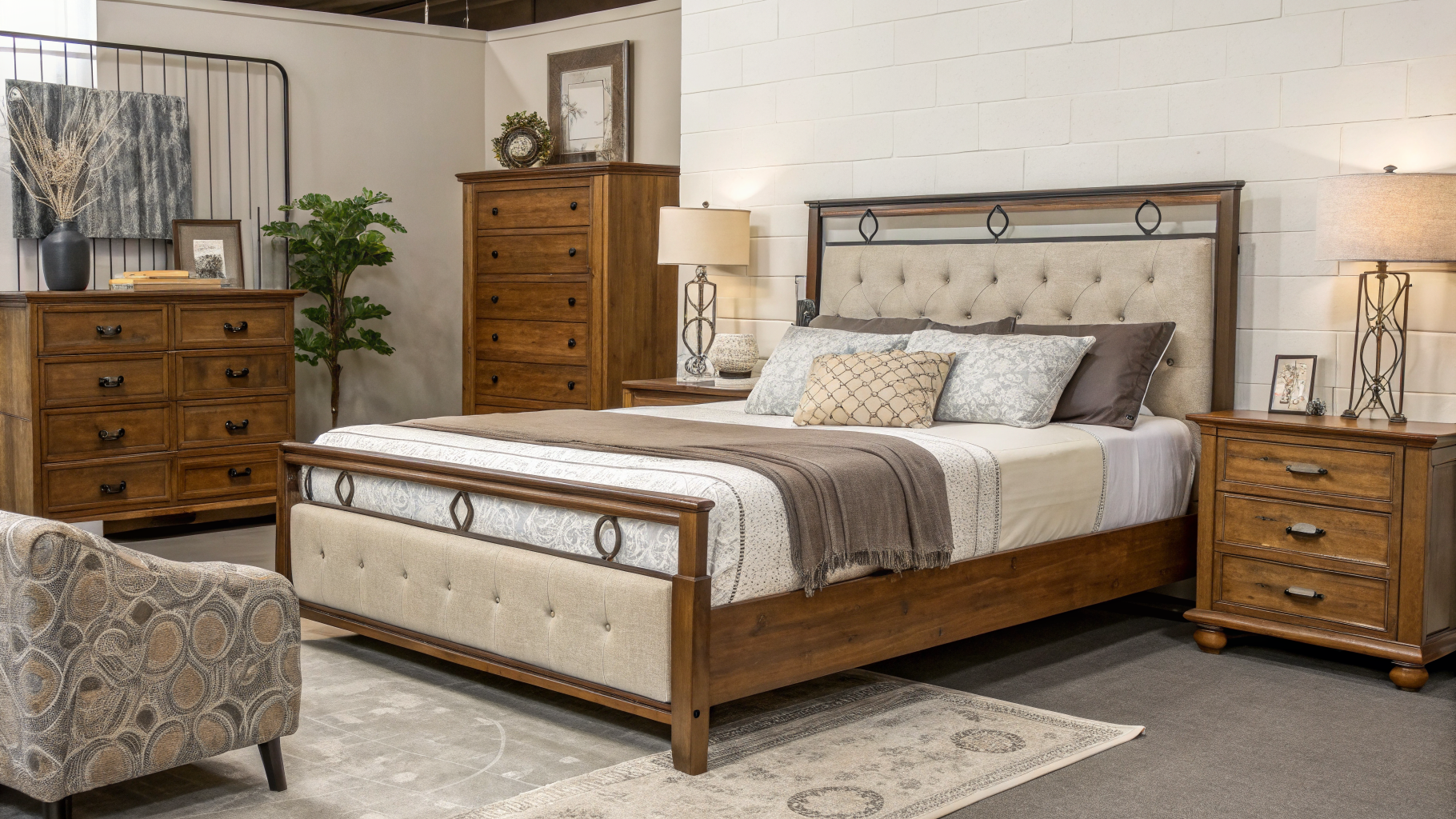
Not sure how to choose a bed frame? This complete guide covers sizes, materials, storage, and styles so you pick the perfect frame for your bedroom.

14 cozy bedroom ideas to make your space warm and inviting — layered textures, warm lighting, and soft textiles that turn your room into a snug retreat.
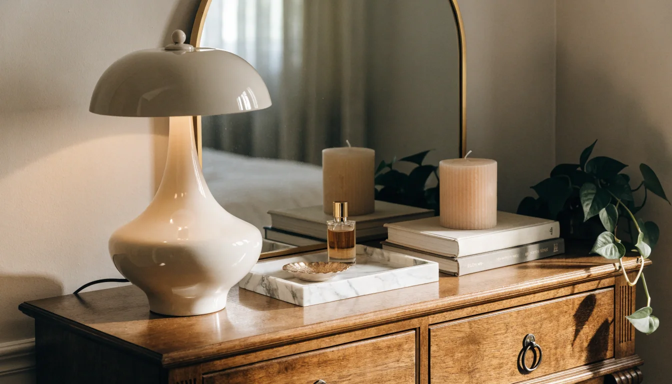
A dresser top can easily become a drop zone for laundry, phone chargers, receipts, water glasses, and all the small things that don’t seem to have a permanent home. The problem is that because a dresser occupies such a visible part of the bedroom, even a little clutter can make the entire room feel less organized. Learning how to style a dresser top is a simple way to make a noticeable difference without redecorating the entire bedroom. The right combination of a mirror or artwork, lighting, decorative objects, useful storage, and intentional empty space can turn an overlooked surface into a polished focal point. You don’t need expensive accessories or a complicated arrangement either. Here are 12 practical dresser-top styling ideas that can help you create a surface that looks balanced, intentional, and easy to maintain. The Basic Formula Behind Every Styled Dresser Before the specific ideas, there’s one framework that makes all of them easier. Almost every well-styled dresser follows the same quiet math: something tall, something layered, and something living. A tall element gives height, a layered element adds depth, and a living element keeps it from feeling static. Once you see that pattern you can build any arrangement from it. Everything below is really just a different way to fill those three roles, so if you remember nothing else, remember tall, layered, living. 1. Anchor One Side With a Lamp A lamp is the easiest way to add height and warm light in one object. Placing it toward one end rather than dead center gives you an asymmetrical starting point that looks more collected than a perfectly centered arrangement. A ceramic-base lamp around 18 inches tall can provide useful height while adding warm ambient lighting. 2. Lean a Mirror Against the Wall A mirror propped behind the dresser instead of hung adds instant height and bounces light around the room, which makes the whole space feel bigger. Leaning it rather than mounting it keeps the look relaxed and lets you layer things in front of it. An arched or thin-framed mirror around two to three feet tall works well for most dressers. The reflection doubles whatever you place in front of it, so a little greenery reads as a lot. 3. Use a Tray to Corral Small Things A tray is the single best trick for a dresser that keeps getting messy. It gives your small items a defined home, so jewelry, a perfume bottle, and a little dish look intentional inside the tray instead of scattered across the surface. I use a marble tray I found at HomeGoods for around $15, and it’s the reason my dresser stays styled instead of sliding back into chaos. 4. Add Something Living Greenery is what stops a dresser top from looking like a store display. A small potted plant, a trailing pothos, or a single stem in a bud vase brings in an organic shape and a bit of color against the wood. If you kill every plant you touch, a good faux stem or a dried element like pampas or eucalyptus does the same visual job with zero maintenance. The point is the organic line, not the botany. 5. Stack a Few Books A small stack of two or three books adds a layer of height you can build on, and it’s the layered element in the tall-layered-living formula. Lay a candle, a small object, or a bud vase on top of the stack to create a mini vignette with dimension. Turn the books spine-in for a quiet, neutral look, or spine-out if the colors work with your palette. Either way, keep the stack low, three books maximum, so it supports the arrangement instead of dominating it. 6. Work in Odd Numbers Groupings of three or five almost always look better than two or four. Odd numbers feel natural and a little imperfect, which is exactly the collected look you’re after. An even, symmetrical row reads as stiff and store-bought. Group your objects in a loose triangle rather than a straight line, with the tallest at the back. That small shift from row to cluster is what makes a dresser look styled by a person rather than arranged by a robot. 7. Vary the Heights A dresser top where everything is the same height looks flat, no matter how nice each piece is. Contrast a tall lamp with a medium book stack and a low dish, and the difference in levels gives the eye somewhere to travel. If two things are the same height and sitting next to each other, raise one on a stack of books or a small riser. Height variation is the quiet ingredient that separates a considered arrangement from a cluttered one. 8. Let It Breathe With Negative Space The most common styling mistake is filling the whole surface. Empty space around your objects is what makes them look intentional, and a dresser packed edge to edge just reads as clutter with better lighting. Leave at least a third of the surface clear. Cluster your pieces toward one or both ends and let the middle breathe, or group them off-center and leave the rest open. The gaps are doing as much work as the objects. 9. Repeat a Material or Tone An arrangement holds together when a color or material shows up more than once. A brass lamp base, a brass tray edge, and a brass candlestick tie the whole top together even if the pieces are otherwise unrelated. Pick one metal or one wood tone and echo it two or three times across the surface. That repetition is invisible when it’s working and is often the reason a magazine dresser looks effortless while yours feels random. 10. Add a Personal Object A perfectly styled dresser with nothing personal on it looks like a hotel. One meaningful object, a small piece of pottery from a trip, a framed photo, a dish someone made, gives the arrangement a reason to exist and makes the … Read more
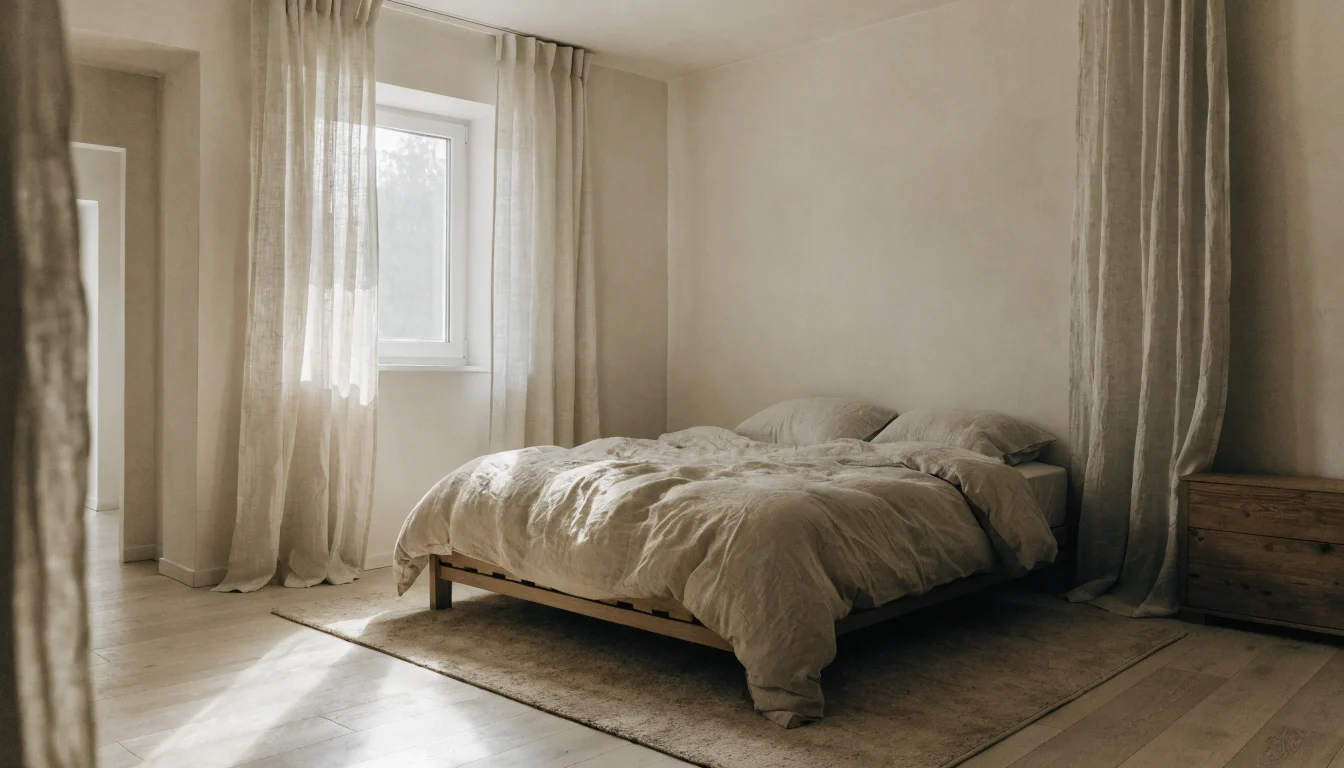
A 9-by-10-foot bedroom can quickly feel overcrowded when furniture is chosen without considering scale. A large dresser, oversized nightstands, or a bulky bed frame may fit on paper but leave very little comfortable walking space. Measuring the room and planning the furniture layout before buying anything can prevent this problem. Most small bedroom layout mistakes come down to fighting the room instead of working with it. Here are the nine I made, or watched friends make, and the specific fix for each one so you can skip the month of frustration I didn’t. Why Layout Beats Square Footage in a Small Bedroom A small room can feel open or suffocating at the exact same size, and the difference is almost never how much stuff you own. It’s placement, sightlines, and how much floor your eye can see when you walk in. Two rooms with identical dimensions can feel a foot apart in either direction depending on where the bed sits and how tall the furniture is. That’s the good news. You rarely need a bigger room. You need a smarter arrangement, and most of the fixes below cost nothing but an afternoon of moving things around. 1. Pushing the Bed Into the Corner Shoving the bed lengthwise against two walls feels like it saves space, and it does save a little floor, but it makes the bed a pain to use and the room feel lopsided. Climbing over someone to get out of bed gets old fast, and one wall of furniture with a big empty patch opposite reads as unbalanced. Center the bed on your longest wall if you possibly can, with a little clearance on both sides. Even a narrow gap on each side lets you make the bed properly and gives the room symmetry, which the eye reads as calm. In a genuinely tiny room, one side against the wall is a fair compromise, but avoid the two-wall corner unless you have no other option. 2. Buying Furniture That’s Too Tall A tall dresser or a towering headboard eats visual space even when it doesn’t touch the floor you walk on. Height draws the walls inward and makes the ceiling feel lower. I had a 54-inch highboy dresser in my first small room and it loomed over everything. Go low and long instead. A wide, low dresser stores the same amount but keeps your sightline open across the top of the room, which makes the walls feel further apart. The same logic applies to the bed frame, which is why a low-profile bed frame almost always suits a small bedroom better than a tall upholstered one. 3. Blocking the Path to the Window Natural light is the single biggest ally a small room has, and people block it constantly. A dresser under the sill, a chair in front of the glass, a bed that cuts across the window all steal the light that would otherwise make the room feel bigger. Keep the area around your window as clear as you can. If furniture has to go near it, choose something low enough to sit below the sill so the light still pours over the top. An unobstructed window does more for a small room than any mirror or paint trick. 4. Using a Rug That’s Too Small A little rug floating in the middle of the floor is the most common sizing mistake I see, and it shrinks the room instead of grounding it. A 3×5 rug marooned under the foot of the bed looks like a bath mat and chops the floor into awkward pieces. Size up and slide it partly under the bed. A rug that extends at least 18 to 24 inches out from the sides and foot of the bed pulls the whole layout together and makes the floor read as one continuous surface. In a small room, a bigger rug counterintuitively makes the space feel larger, not smaller. 5. Cluttering Every Surface Every flat surface in a small room is a temptation, and a full nightstand, a crowded dresser top, and a windowsill lined with objects add up to visual noise that makes the room feel busy and tight. The eye has nowhere to rest. Clear your surfaces down to a few intentional items each and store the rest out of sight. My rule is a lamp plus one other thing on the nightstand, and no more than three items on the dresser top. Empty surface is a luxury a small room should spend on itself. 6. Choosing Heavy Window Treatments Thick, dark curtains that stop at the windowsill make a small window look smaller and a small room look boxed in. Short curtains cut the wall in half horizontally, which lowers the whole room visually. Hang curtains high and wide, close to the ceiling and extending past the window frame on both sides, in a light, airy fabric. Mounting the rod near the ceiling draws the eye up and makes the wall feel taller, and letting the panels fall to the floor adds an unbroken vertical line that stretches the room. 7. Ignoring the Space Under the Bed In a small bedroom, the area under the bed is the most wasted storage in the house. Leaving it empty while your closet overflows and bins pile up in the corner is a missed opportunity that costs you floor space elsewhere. Use flat under-bed storage for off-season clothes, spare linens, and anything you reach for rarely. A bed frame with built-in drawers does this cleanly, and clearing the corners of a room by moving that overflow under the bed is one of the fastest ways to open up the floor. 8. Overfilling the Room With Too Many Pieces A small bedroom does not need a bed, two nightstands, a dresser, a chair, a bench, and a bookshelf. Every extra piece is another thing the walls have to accommodate, and past a certain point you’re just navigating an obstacle course to reach the bed. Decide what the … Read more
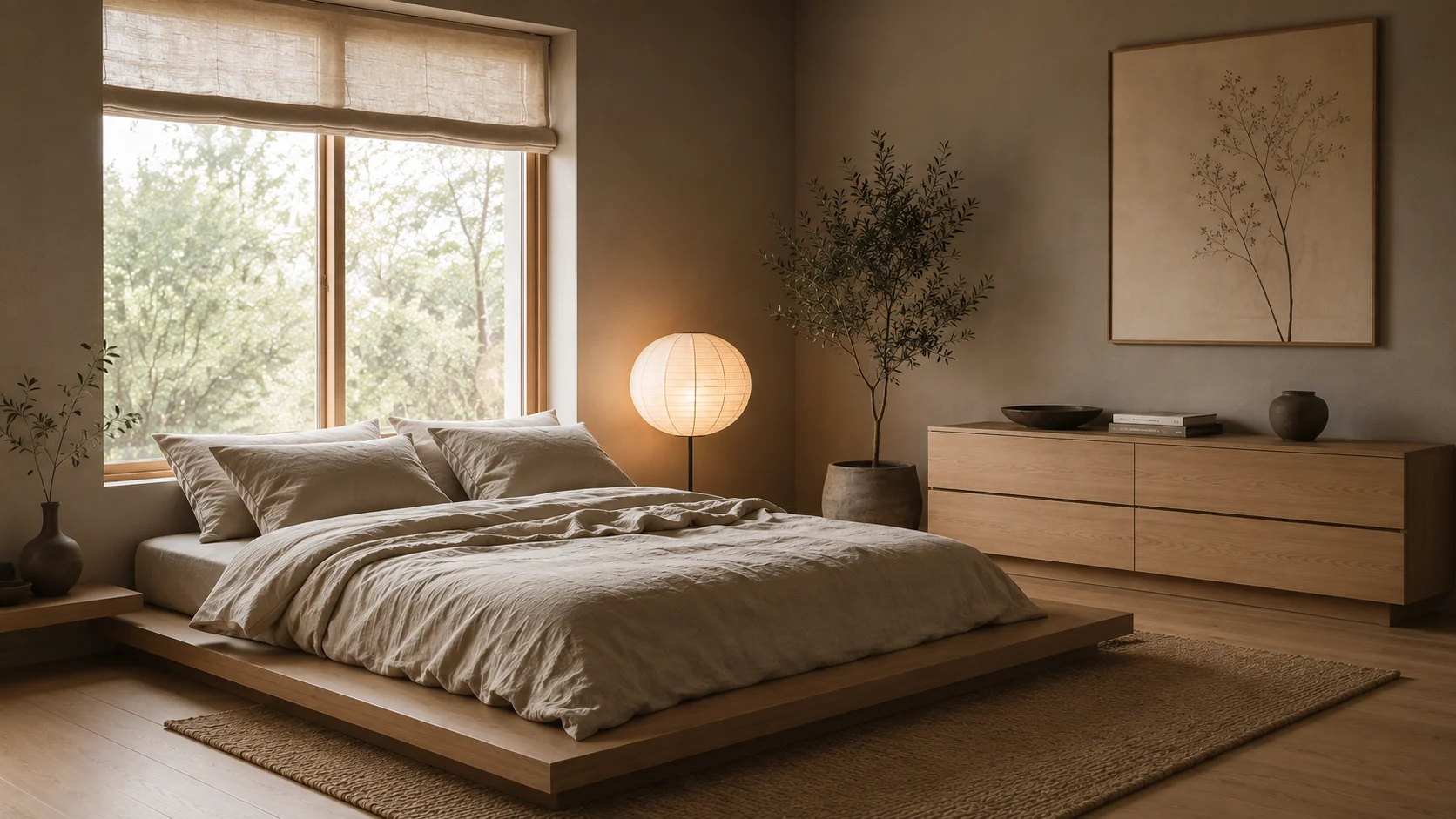
A beige bedroom can look minimalist without actually feeling calm. When a room is stripped of too much texture, warmth, and personality, simplicity can quickly start to feel empty instead of intentional. That’s where Japandi bedroom ideas can make a real difference. By combining Japanese restraint with Scandinavian warmth, Japandi design creates spaces that feel simple and uncluttered without becoming cold or lifeless. Natural materials, soft textures, warm neutrals, thoughtful lighting, and carefully chosen furniture all contribute to the effect. The good news is that creating a Japandi-inspired bedroom doesn’t require replacing everything you own. A few thoughtful changes can transform the atmosphere of the room. Here are practical Japandi bedroom ideas to help you create a space that feels warm, balanced, and genuinely restful. What Japandi Bedroom Actually Is (and Isn’t) Before the list, it helps to know what you’re aiming at, because the word gets thrown around loosely. Japandi is the overlap between two design traditions that already agree with each other. Japanese design values wabi-sabi, the beauty of imperfect and natural things, and empty space as a feature. Scandinavian design values hygge, warmth and function and light-toned wood. Put them together and you get a room that is spare but never cold. That is the tightrope. A Japandi bedroom is minimalist in count but rich in texture, neutral in color but warm in feel. If your room ends up looking like a hotel lobby, you leaned too Scandinavian and forgot the soul. If it feels bare and a little sad, you leaned too far into empty and forgot the warmth. 1. Start With a Low Bed The fastest way to signal Japandi is height, or the lack of it. A low platform bed sits closer to the floor and makes the ceiling feel taller, which does more for a small room than any amount of clever storage. I found a solid oak platform frame on sale for around $340, and dropping my sleeping height by about eight inches changed the whole proportion of the room. Look for a frame with visible wood grain and simple legs or a solid base. Avoid anything upholstered in a busy fabric or finished in high-gloss black. The bed is the largest object in the room, so if it gets the tone right, half your work is done before you touch anything else. 2. Give the Bed Room to Breathe Leave space around the frame if you can. A bed shoved into a corner fights the calm you’re after, and Japandi lives on negative space. Even six inches of clearance on the far side reads as intentional instead of crammed, Leaving visible space around the bed can make a compact room feel less crowded. Even a small amount of clearance on the far side helps the layout look more intentional and makes it easier to move around the room.. If your room is genuinely tiny and the bed has to go against a wall, keep the other three-quarters of the room as open as possible to compensate. The eye needs somewhere to rest, and empty floor is that resting place. 3. Build a Warm Neutral Base Japandi leans neutral, but flat white walls tip into clinical fast. Japandi interiors usually benefit from warm neutrals rather than stark white or cool gray. A warm greige such as Benjamin Moore Pale Oak can add subtle warmth while maintaining a calm, understated backdrop. Cool grays photograph well and live badly, so test a sample on your actual wall before committing to a whole gallon. Paint sheen matters more than people expect here. A matte or eggshell finish absorbs light softly and suits the muted mood, while satin and semi-gloss bounce light in a way that feels harder and more modern. For a Japandi bedroom, flatter is almost always better. Colors That Work as a Base 4. Layer Your Neutrals Instead of Matching Them Matching every tone flattens a room. A bone bedsheet, an oatmeal throw, a slightly darker sand cushion, all sitting together, is what makes a simple palette look designed rather than unfinished. The variation between tones is the point, not a mistake to correct. The way I check this now is to squint at the bed. If everything blurs into one flat block of color, I add a tone a few shades off. If it looks busy, I pull one thing out. You want three or four related neutrals in conversation, not one repeated five times and not eight fighting. 5. Let Texture Carry the Interest Color stays quiet in this style, so texture does the heavy lifting. A room with five shades of the same beige can still feel rich if the surfaces are varied enough. These are the materials I keep coming back to: Mix at least three of these and the room stops looking flat. Linen is the one I would start with, because it works hardest, softening the whole bed the moment it goes on. 6. Fix the Lighting Before You Buy Anything Else One harsh ceiling light will undo every calm choice you make. I unscrewed my bright overhead bulb, dropped in a 2700K warm bulb, and the room softened before I spent another cent. Lighting temperature is the cheapest, most overlooked lever in the whole style. Check the Kelvin rating on any bulb you buy. Anything labeled 2700K to 3000K gives that warm, candle-adjacent glow. Anything at 4000K or above pushes blue-white and belongs in a garage, not a bedroom you want to relax in. 7. Use Two or Three Low Light Sources Aim for pools of light instead of one bright center. A small table lamp, a paper lantern floor lamp I picked up for about $55, and a single candle give you layers that feel restful after dark. A room lit from several low points always reads calmer than one lit from above. Paper and rice-paper shades are a Japandi signature for a reason. They diffuse light into a soft glow instead of a … Read more

Find the perfect convertible sofa bed for small spaces. Stylish, compact, and functional options ideal for maximizing comfort and space.

Discover the best curtains for bedroom décor—blackout, sheer, and modern styles to improve comfort, privacy, and design.

Combine storage and entertainment with a TV stand dresser for bedroom use. Functional designs that save space while keeping everything organized.